Please take a look at my portfolio.
24. Generations of Dunking
 Oreo will turn 100-years-old this year, and has proven that it can last the test of time. The simple chocolate cookie with a cream filling has sowed itself in the fabric of America. For as long as I can remember, children and adults have always loved Oreos.
But why?
My answer is Oreo has been telling consumers that there is no proper way to eat an Oreo. There is the classic dunk in the milk approach, the winner-takes-all twist to see who gets the filling, and a vast variety of other ways people choose to enjoy the snack.
Let’s take a moment to see how, or if Oreo’s ad campaign has changed over the past few decades.
1980s:
The commercial from the 1980s suggests that there is no proper way to enjoy the snack. Although the popular ways depicted in the commercial include the Oreo dunk in milk and the twist.
1990s:
In this 1990s Ore ad we see the same principle of dunking the cookies in milk. Also, you can see that Oreo is branding itself as a staple of childhood snacks. I say this because you can see this theme stay true from the 1980s commercial to this commercial. It will be interesting to see if these themes change in the upcoming generations.
2000s:
In this Oreo ad from the 2000s, the company is selling a new product, but some of the universal themes are still exist. I enjoy how Oreo shows a single person’s style of eating the cookie and how their style doesn’t change over time. The ad reinforces the fact that Oreo is a staple for childhood snacks, but moves away from the idea that Oreo is a snack that should be shared.
2011:
This 2011, ad is great because you can see that Oreo has transcended across generations and migrated to foreign markets. The theme that it is a childhood staple is ever present, as well as Oreo is a snack to share. I also enjoy how the cookie is twisted and then dunked.
It is interesting that Oreo has been selling the same product for 100 years and over the last 32 years the companies advertising and marketing strategy has stayed the same. I guess that is how the old adage goes: If it isn’t broke then don’t fix it.
23. Great Product Design
Other than brand name, what makes an iPod better than a Zune?
My answer is the iPod has beautiful product design. The two products have similar internal characteristics, yet you probably do not know what a Zune is or you have forgotten by now. Product design is essential to the sales of the product. Advertising will help sell a product, but often times design will be a difference maker between a consumer buying your product or your competitors.
I came across a few products that use design to help sell the product. Check them out and I hope you enjoy.
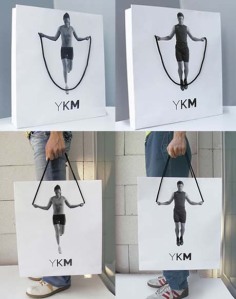
This YKM bag is genius I tell you. How awesome is the illusion it creates of a person jump roaping. I’ve never seen a shopping bag this creative before and had to share it.
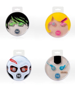
This headphone company packages their product in a package that creates a face. I love this because it gives each product some funk and flair. The design doesn’t sell to me, but if I were younger I would be all about having these headphones.
I think that what Mulher did with their packaging for the watches they sell is cool. Each watch comes in a small box with half of the watch sticking out, which serves as a mini handle. This packaging design concept is innovative, as I have never seen something like this before. The packaging on this product would be a difference maker when it comes to the decision of whether or not to buy.
Panasonic did a great job packaging this set of headphones. I really like how they take the headphones and make a direct connection to music. It is simple, yet eloquent. Rather than taking a set of ordinary headphones and packaging them, Panasonic was curious about how they could ad flair to their product and did an amazing job.
22. Write the Future
In 2010, Nike produced one of the best commercials I have seen for an athletic apparel company. The commercial features all-star caliber soccer players from across the world. In the commercial, each player is presented with the opportunity to win the World Cup and be forever idolized by their country. Each player foresees his own fate as he imagines it to play out if he wins or loses the game.
What works so well for this commercial is its ability to move freely from one character plotline to another’s so seamlessly. Another great aspect of this commercial is it has never been televised. The ad only has appeared virally and on Youtube, there are several copies of this ad with over 1 million views.
21. But Wait… There’s More!
We’ve all seen the commercials that are selling a seemingly less than trustworthy product. The product being sold could be the Little Giant, Magic Bullet, Sham Wow, or any other product that falls within this category. In this case, the product is Flex Seal.
Actually, the product doesn’t matter because the point I want to get at is that all of these commercial, no matter what the product is seem exactly the same. They all start with a small, universal problem and make it seem like it could be the end of the world, but then the product is introduced and the day is saved. The copy in the commercial is always some form of boring clipart, and the speaker is guaranteed to have an obnoxious, in your face voice.
By far, the best part of the commercial is the “but wait” announcement; they are a staple to these commercials. The “but wait” announcement is usually followed with “by calling now you will receive two products for the price of one.” The thing is, I never call in, nor do I know anyone that has.
My only problem with these commercials is that they all feel the same. The company that owns the product being sod should take more pride in the item and use a different ad agency next time.
20. It’s Not for Women
I caught myself thinking about the Dr Pepper TEN commercial that came out some time last year and though I’d blog about it. I particularly enjoy this commercial because of its aggressive advertising and marketing strategy behind it. The genius part of the ad is that the few calories that are in the soda make it “manly,” unlike other diet sodas. There are more than enough male stereotypes in the ad, and I would imagine that Dr Pepper received some flak for this. But its aggressive take towards who Dr Pepper TEN is advertised towards is what I think this commercial does best.
19. Advertising to Your Subconscious
You better believe that advertisers have taken into consideration how they can advertise to you when you are not looking. Have you ever stopped and thought about if there is an ad within the ad you are looking at? Well, I’ve noticed a few over the years and thought I would share a few with you.
Fed Ex:
The logo reads Fed EX, but what you probably don’t see is the white arrow between the “e” and “x.” The white arrow is there to remind people of Fed Ex when ever they see an arrow.
Amazon:
I believe that most people can see the arrow and the smiling face in this logo. What people are missing is that the arrow goes from “A” to “Z.” Amazon is telling people that they cover everything from “A” to “Z” without saying a single word.
Big 10 Conference:
If you don’t know college sports then you will not know what is going on here. The Big 10 is unique because the name implies there are 10 teams in the conference, but there are 11. If you look on either side of the “T” you can see the 11 start to emerge.
Baskin Robbins:
Baskin Robbins is known for the 31 flavors of ice cream that they offer. However, I’m sure they have closer to 50 flavors these days. The point is that when Baskin Robbins was founded it was known for having 31 flavors. If you look at the pink in their “BR” logo you can see that even Baskin Robbins advertises to our subconscious.
18. Proctor & Gamble’s Smart Media Planning
We all love those classic Old Spice commercials. The way they freely move from one miscellaneous masculine characteristic to another with nothing connecting the dots but the person saying them is their trademark. However, their brand is Old Spice.
After those commercial ran their course, Old Spice introduced the world to a new spokesperson that was even more masculine and obnoxious than ever before.
Recently, Old Spice commercials have been doing something completely unorthodox: Or is it?
Check it out:
The commercial features Bounce and Old Spice, but it’s an Old Spice ad; right?
Well, yes and no. Let me take a minute to explain.
Old Spice and Bounce are both their own brands, but they are owned by the same parent company; Proctor & Gamble (PG). Therefore, when you really think about it, the ad is for not Old Spice or Bounce, but for two products owned by PG.
I love this ad because it stays true to the themes that appear in Old Spice as well as Bounce ads. The ad takes two polar opposites and makes it work.
For PG this is a great thing because it can cut media spending in half. Rather than spending funds on two 30 second long commercials, PG put two of their own products in one 30 second timeslot.
The combination of the two product campaigns is unorthodox, but the combination of selling the products is a smart, level-headed business decision for PG.
17. The Power of Story Telling
 We all have seen the commercial for the SPCA, Christian Children’s Fund, and just about every other charitable organization. They show images of sad children, animals that look malnourished and less than ideal loving situations. Often times the ads pull on an emotional cord that urges you to donate to the specific cause they are advocating for. There is nothing wrong with this because that is the purpose of the advertisement.
But, how could these types of organizations use advertising more efficiently?
My answer comes from a commercial put out by Ogilvy Johannesburg for their client Topsy. Topsy’s mission is to partner with rural communities, empowering people infected with, and affected by, HIV and AIDS, through medical care, social support and skills development.
Check out the Topsy commercial:
I believe this commercial is in a different league than the other charitable organization commonly seen on television, because Topsy went in a different direction. Making the ad human and telling a story is what I am referring to.
The ad introduces us to Selinah and we find out she has AIDS. From there we find out that Selinah was brave enough to be filmed for 90 days to show the effects of AIDS. What we don’t realize right away is that the time-lapsed images are in reverse order, and we are seeing how Selinah looked prior to using the services offered by Topsy.
The ad ends with two notes: “The effects of AIDS can be reversed,” and “Help us provide the treatment that can give someone a second chance.”
Selinah’s story does get better. Ogilvy produced a short-film that documented Selinah’s recovery. This added to their use of storytelling, as it allows people to become more involved and attached to the fate of Selinah.
Take a look at Selinah:
The ad is successful because it resonates with us. Even for an unfortunate individual in rural Africa that has AIDS there is hope, and this is witnessed through Selinah’s story.
16. Football From Across the Pond
 The United Sates loves football. As Americans, we live for that shit. If someone were to ask you “by football, do you mean soccer?” you would probably look at them with some look of confusion, because this is America.
But, what about when you go to Europe?
In Europe, the most popular sport is fútball, as in soccer, not football. However, football does exist in Europe. The thing is American football is not a popular sport in Europe.
So how do American football teams in Europe address the issue?
Just take a look at what the Düsseldorf, Germany American football team, the Düsseldorf Panther, is doing to call attention to the sport.
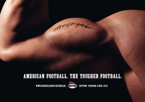
 After hiring the ad agency McCann Erickson Germany, the Panther were left with an ad that demands people’s attention. The bold, capitalized copy is easy to read, and it challenges the psychographic of the majority of Europeans, who would likely disagree.
In addition, the ad plays with the image of a football. Football players are known for being buff. This ad plays with that too. The bicep of in the ad, with the stitches that resemble the laces on a football is genius, because it keeps the ad simple, clean and gets to the point.


